
Right off the bat the initial impression of the piece was that the details were far too small for players to take any notice of them. Rather, from a distance the piece looked more like a circular lump of wax. It wouldn't do, so redesigning the piece was in good order.
Despite its visual flaws, I still made use of the piece. It gave me an opportunity to refine my casting procedures and experiment with color matching.
By mixing different ratios of white to a color of choice I can create varying shades of a particular color. Pictured below you can see a range of blues that I had worked on.
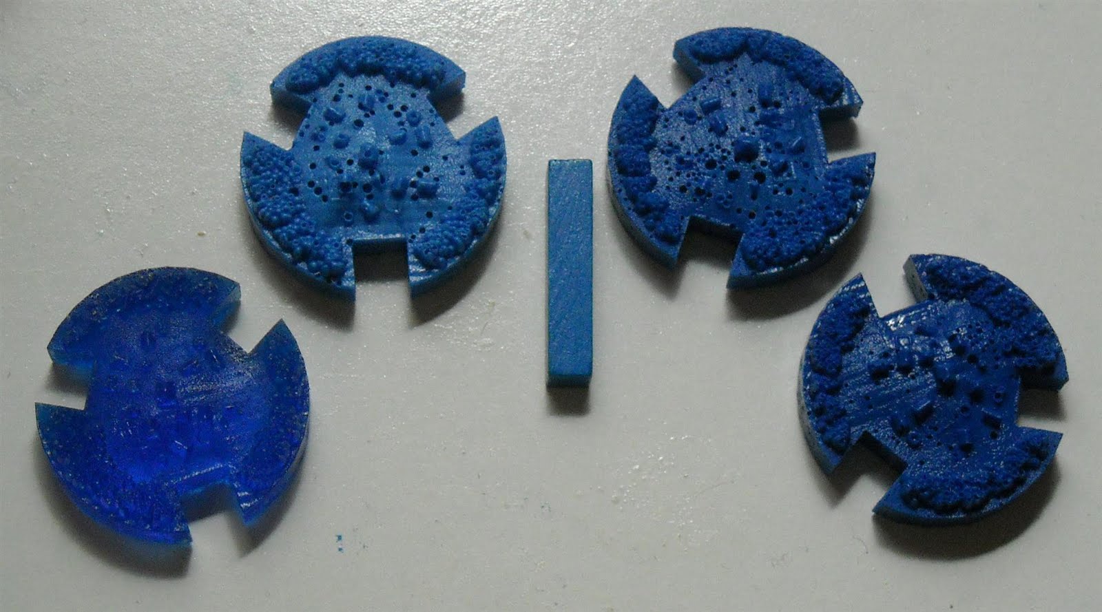

Above you can see a wooden game piece lying next to the Medieval Settlement is most closely matches. Though there are a number of variables that make getting a perfect match difficult (texture, dirt residue, light reflectivity) there is a visual variable that calls for proper balance. Take a look at the following two blue Medieval Settlements.

Which of these two Medieval Settlements are the details more easily distinguishable in? When a material is too dark, it "absorbs" the shadows cast by the details. The lighter the material, the more readily the shadows appear allowing the viewer to realize the depth and contour of the piece.
A balance between visual detail and color matching needs to be considered when selecting the final shade.
While "playing around" with colors, I spent a portion of my time reworking the layout and scale of the settlement. Version 2 of the Medieval Settlement is taller and contains fewer elements that are scaled more than 2x larger from Version 1. Because the scale was larger I could add some details that might not have been noticeable, otherwise, on the smaller scale Version 1.


Version 2 is currently off at the printers and should arrive around the 11th of November.
No comments:
Post a Comment